Art College - Week 2 - Four World Exhibition
- Sep 9, 2015
- 4 min read
As a task to get to know people on other courses, we were split into 4 groups and given a theme. With this theme we had to create a set which could be exhibited at the end of the 2 and a half days. The four topics were festivals, futuristic, wonderland and urban.


Above is 4 of my photos which I took of the festival set, the theme ‘festival’ was taken in two different ways; music festivals and annual festivals (such as Chinese new year). I am quite happy with the first 2 festival photos as they capture the artwork and set work from other groups of people – also adding mood to the work. The first one is quite spacey as you’ve got one main focus with pretty empty yet textured surroundings. The second one links in a dynamic mood with the photograph and physical artwork. The darkness to right and left hand side adds depth into the image, creating a deep and powerful mood. The third and fourth photos are more to just document the other groups work. The photos capture the essence of festivals; the rawness of the music festival atmosphere and the work of others in the artist world.

This picture was taken inside the futuristic set. They took the thought of small things being big and everything being quite rustic and raw into their set which looked quite effective. The picture collects their set today quite well as a whole because it was quite rustic, brown and dull. My photo has good composition as the way the big insect is placed in the top corner makes it stand out quite a lot against the dull flooring and background. It would’ve been a better photo if I had focused it more onto the insect rather than the entire scene. It would’ve been more effective and eye catching if I had blurred out the rest of the image.


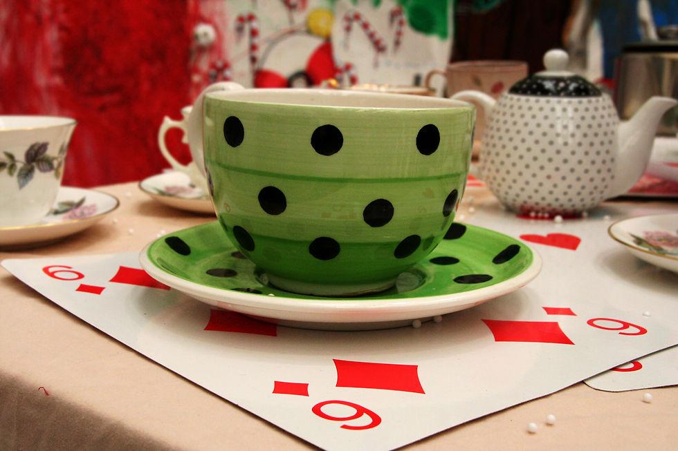
The third set was wonderland, this set was very well produced and thought about. It was clearly planned out and placed as the different themes sort of merged as you went round the set. It all linked into something else in the set even if it was just a common colour. The photos capture the colours associated with wonderland as well as the objects and items. The first photo is of playing cards relating to films and books like Alice in Wonderland and things like dreams and fairytales. I decided to change the photo into black and white in order to make the hearts and diamonds near the centre pop. I used colour popping as a way of adding extra mood and depth into the fairytale and wonderland idea. If I were to re edit the photo I would colour pop all of the red symbols to make it more spread out across the entire image. The second photo captures the thought of the book Alice in Wonderland – as it is a book, by making the butterflies from book pages adds an edgy element to their set. I decided to use colour popping on this image also as it brought out some of the colour and fairytale/story elements. I chose to pop the blue and green butterflies as they’re mainly in the top right half corner and it would look quite nice against the plain black and white bottom left hand corner. It could’ve been a better photo if I had maybe popped all of the butterflies which could add more dimension. The last photo definitely fits in with the wonderland theme as its of a table inspired from the book and film Alice in Wonderland. The teacups and cards are a massive part of what people think about when it comes to Alice in Wonderland therefore it fits very well into the theme. Most of the focus in my photo is on the green and black spotted teacup at the front, to make this more prominent I blurred out as much background noise as I could.


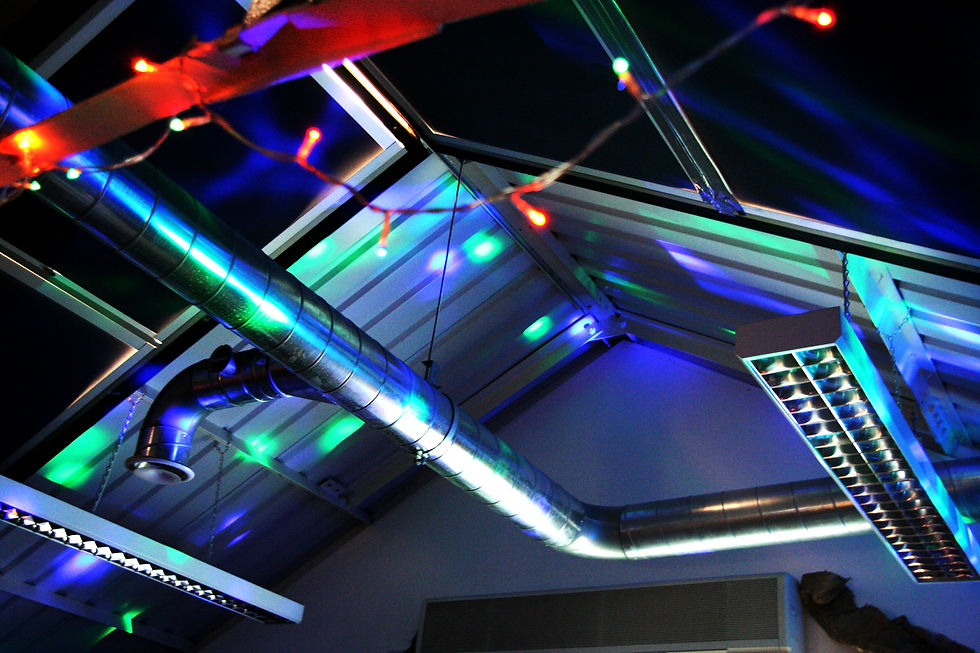

The last selection of photos are from the urban set which was the group I was a part of. We made the room as relatable and as like the streets as we could. We took photos of the streets and things you’d find around urban areas and then created a photo wall with them. Other than the photography side, we created brick walls, small sections of rubbish and general things you’d find lying around on the ground in urban streets, as well as changing the lighting in the room to look more current with fairy lights and rope lights. The 4th photo in the selection captures the lighting very well as the photo is pretty much entirely towards the lights and nothing else. The pipes and materials on the ceiling add a street vibe to the photo as the pattern and lines created by them are quite powerful and stand-out. The last photo manages to capture the type of texture you can find in an urban environment as well as the stuff you can find hanging around the streets in the urban street environment. I like the lines in the image as it creates depth with shadows.


Comments